 · 2 min read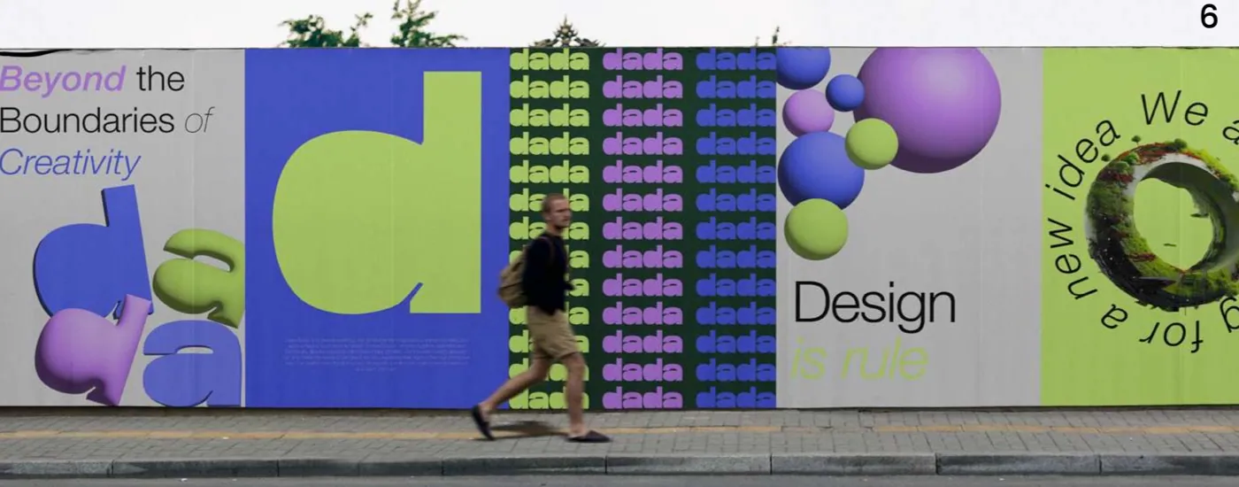
A logo is the face of a brand and the foundation on which every design element in the branding process is built. That's why a good logo isn't a symbol drawn in a moment; it's the result of a process that starts with understanding the brand and is carefully tested. Below we explain the steps a logo project goes through.
1. Discovery call
The process starts with getting to know your brand. What do you do, who do you speak to, who are your competitors, how do you want your brand to be perceived? Talking about examples you like and dislike also helps find direction.
2. Research and moodboard
With what we learn in discovery, we study the industry and competitors and look for the space where the brand can stand apart. Then we prepare a moodboard showing directions for color, form and typography. The moodboard creates agreement on the visual direction before drawing begins.
3. Concept development
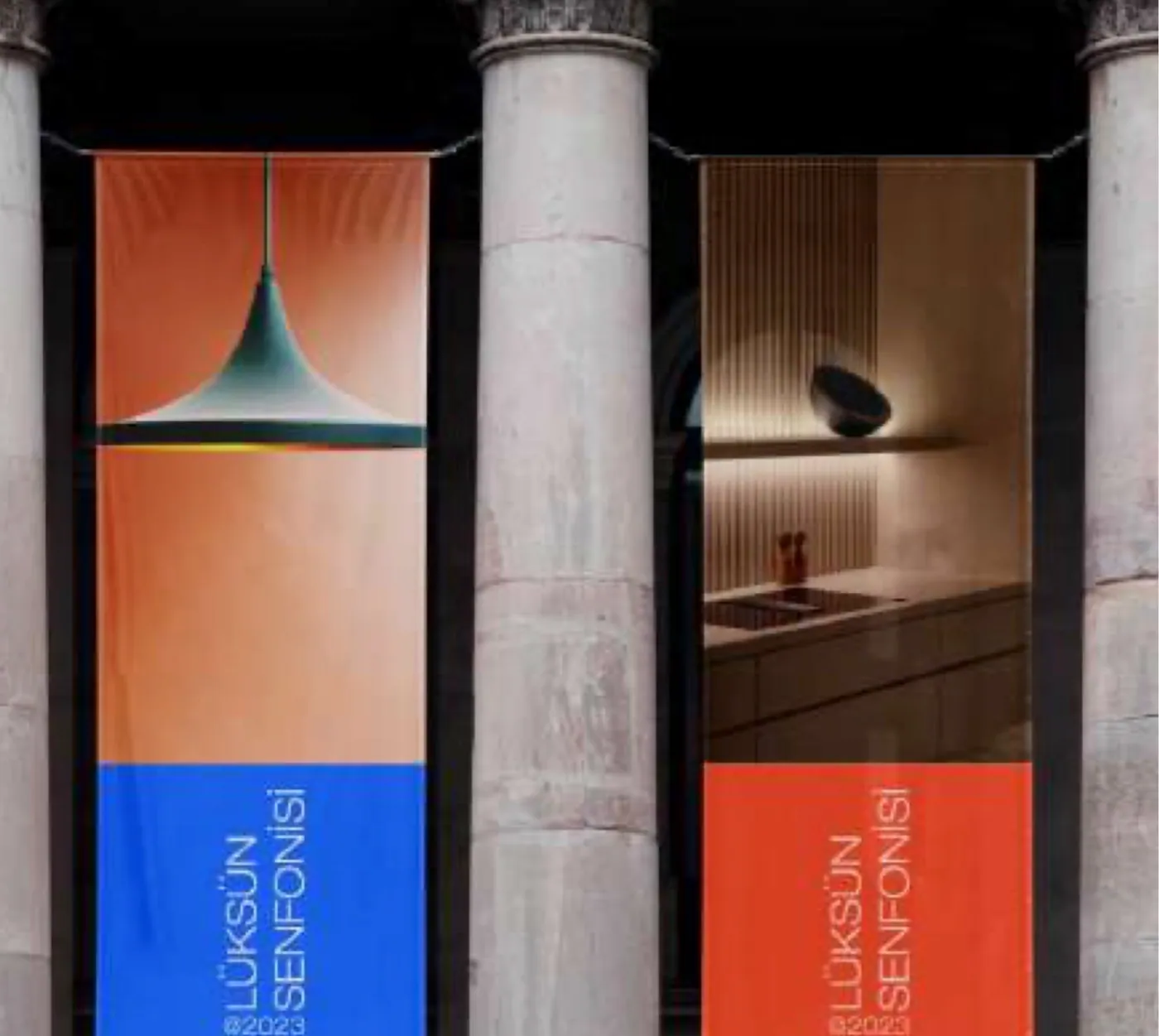
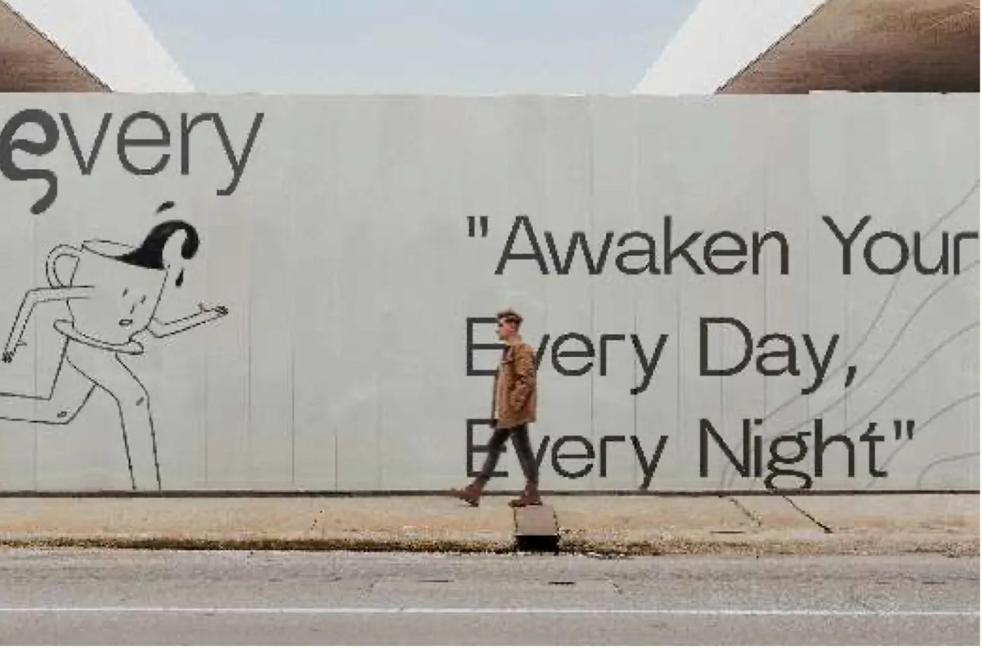
In this phase we produce distinct concepts. Each tells the brand's story in a different way: some typographic, some built on a symbol, some a combination of both. We present concepts not only on a white background but on real usage examples, so you can see how the logo will look on a business card, an app icon or a sign.
4. Refinement and revisions
We keep working on the chosen direction. Proportions, letter spacing, stroke weights and colors are fine-tuned, and revision rounds follow your feedback. In this phase we also test the logo's legibility at different sizes.
5. Variations and usage rules
- Primary logo, secondary lockup and brand symbol
- Horizontal, vertical and single-color versions
- Applications on light and dark backgrounds
- Minimum sizes and clear space definitions
- Color codes (CMYK, RGB, HEX)
6. Delivery
Finally, we deliver vector source files and all formats prepared for print and digital use, together with usage guidelines. For legal processes such as trademark registration, files are provided in suitable formats.
What makes a good logo
A good logo is simple, distinctive and memorable; it's legible both as a small icon and on a large facade, works even in a single color, and is built on the brand's strategy rather than passing trends. Thinking about your logo together with the rest of your corporate identity gives the healthiest result in the long run.
 Blog
Blog