ERTS
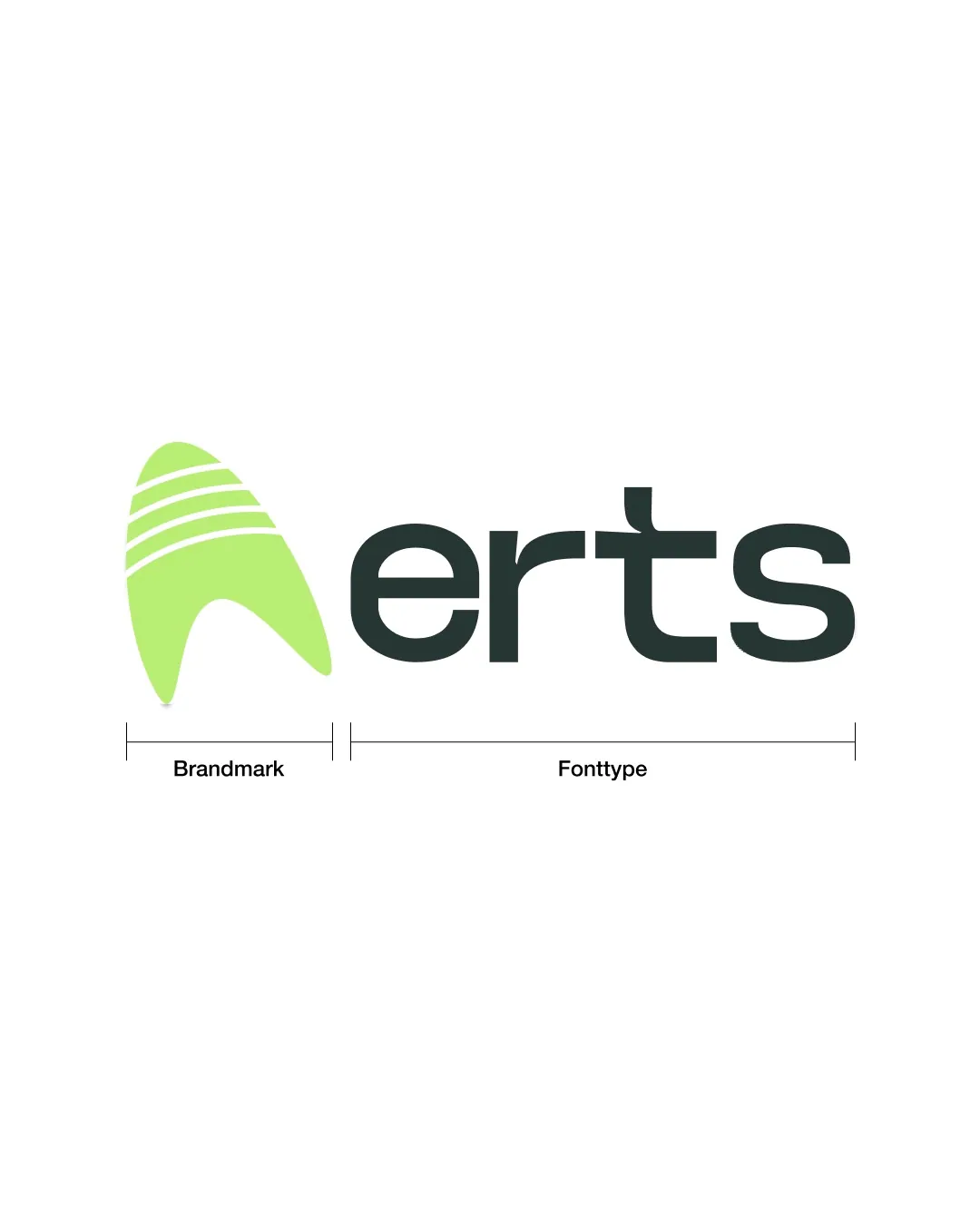
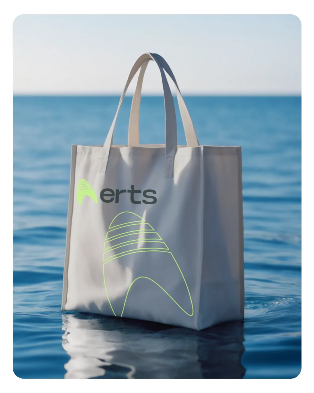
For clean energy producer ERTS: a brand mark that unites wind and leaf in a single form, and a pictogram system that carries all communication.
Brand
ERTS
Industry
Renewable Energy
Year
2024
Services
- Logo Design
- Corporate Identity Design
- Brand Guidelines
- Campaign Communication
Challenge
 Challenge
A producer operating in regions where access to energy is difficult needed to convey both its technical reliability and its environmental stance at the same time.
Approach
 Approach
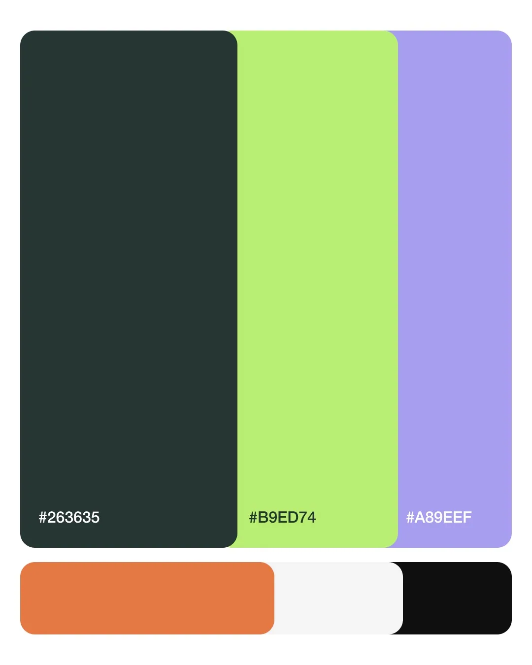
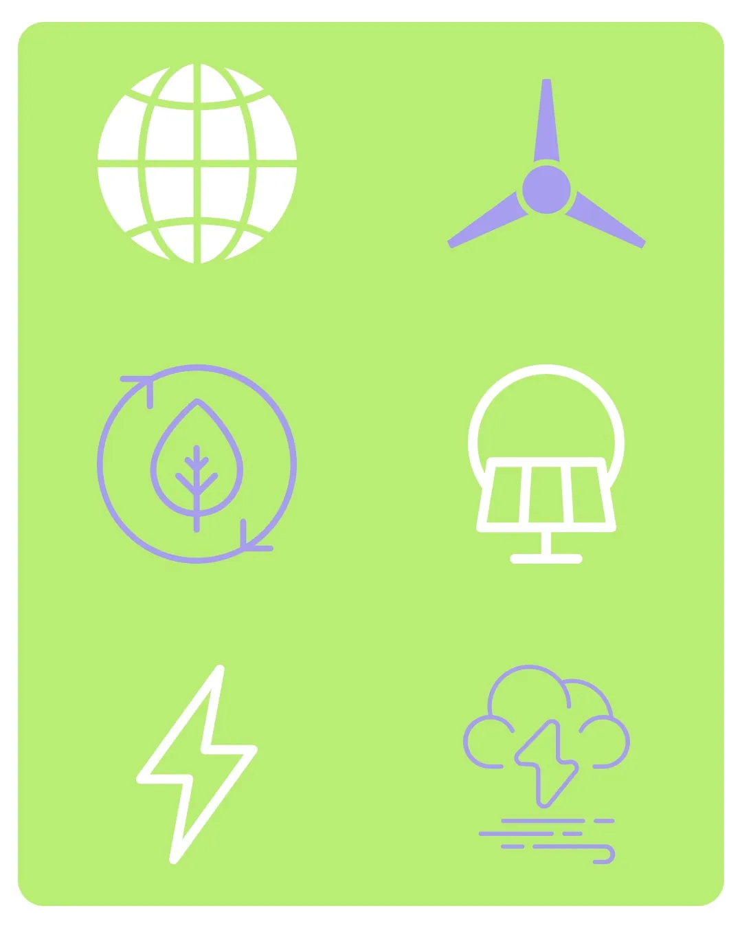
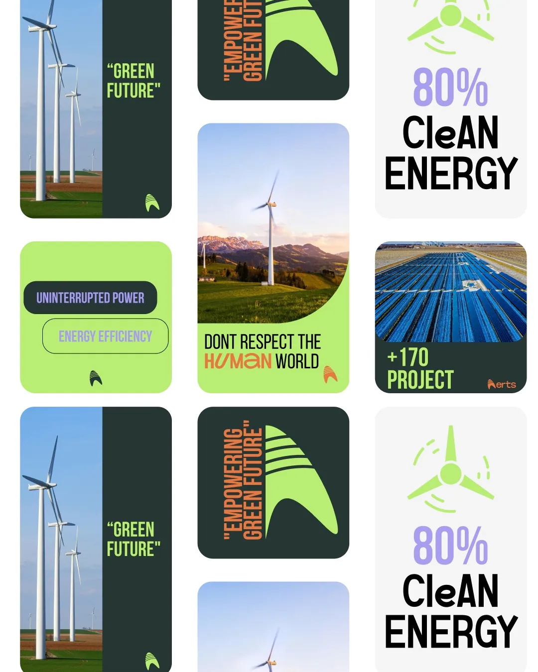
We built the brand mark as a single form that overlays a turbine blade and a leaf. A trio of deep forest green (#263635), fresh green (#B9ED74) and lilac (#A89EEF) created a palette representing energy, nature and technology. The communication language was completed with a family of pictograms explaining technical topics such as energy storage, carbon footprint and uninterrupted power.
Result
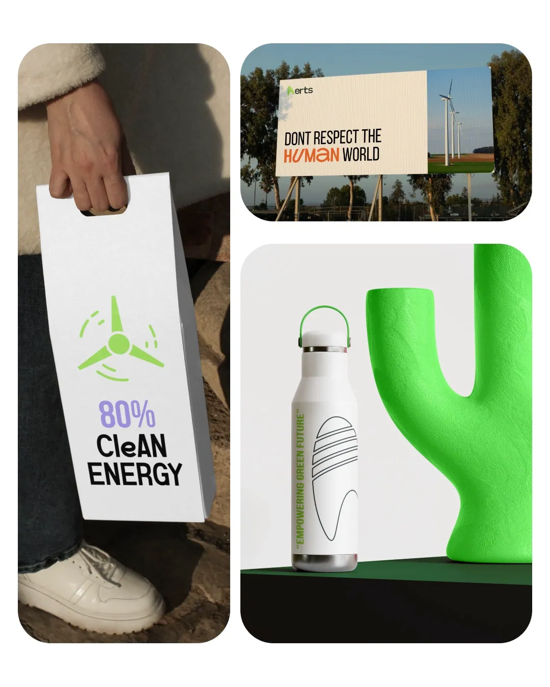
The "Empowering Green Future" umbrella message went live across outdoor, social media and print channels with a single visual system.
Color palette
The scale built for ERTS
The system in the real world.